Pages

Sunday, 2 October 2011

Module 1 Chapter 8 (page 13)

Collections of lines


Taking a Line for a Walk


This was fun to stitch and it was interesting to try to create the same kinds of lines in the original drawing - the cartwheel shapes were the most challenging to complete.

Taking a Line for a Dance


This sample was more interesting to stitch, as I think that the shapes I drew were more interesting. Stitching lacks the same kind of spontaneity that can be achieved with a pen or pencil and curved lines can become quite 'jerky' if you lose concentration!

Mark Making


This sample was created with different parts of a paintbrush and black ink. I quite like the effect created by the dry brush where the hairs has separated into two 'prongs'.


This sample was created with black ink and a toothpick. I didn't like the different effects I achieved at first, but looking back at it a few days later could see some potential for lines to stitch, as the toothpick made quite fine lines on the page.


These thicker lines were created with a natural sponge and black ink, used by dragging the sponge across the page and by dabbing the paper. I can't draw much inspiration for stitching from this at the moment - maybe the lines are just too thick?


This sample was created with a foam 'wedge' artists' brush. I don't really like any of the thicker lines, but some interesting effects have been created by using the side and end of the brush and dabbing at the paper. These might become interesting patterns to stitch in the future...


I used a cotton reel for this sample, which resulted in some interesting patterns when the end was used. I particularly like the effect of overlapping the prints.

The above effects were created with a lolly stick and a pipette - I tried to recreate some of the taking a line for a walk/dance shapes from earlier in the chapter to see how they would differ. Using ink and a pipette meant that some of the lines were thicker or narrower, depending on how much ink escaped from the end of the pipette!


The final sample was created by using a twig that I found in my garden. Using a natural material gave a more dynamic feel to the lines, as the twig wasn't a uniform shape or width, like some of the other instruments used.

Mark Making


The crayon made lots of different types of marks on the page - thinner ones by using the tip and thicker, softer ones by using the side. Being soft, I was able to make quite 'fluid' lines with the crayon that flowed across the page.


I used a soft 6B graphite pencil and a carbon pencil to create the marks in the above picture. The 6B pencil created quite soft, gentle lines, but the carbon pencil was quite 'scratchy' and I was able to achieve more 'spiky' marks, as well as softer, curved lines.


I used charcoal to create the lines in the first picture above. The marks are quite thick and dark, but I was able to achieve different effects by using the edge of the charcoal stick or the sharper edge.
The second set of lines were created by using an 8B pencil. I was able to create thicker, softer lines or thinner ones by using either the side of the lead or the tip.


The lines in the pictures above were created by using black pens. For the first sketch, I used a very fine tipped artists' pen and was able to create very fine lines that would transfer easily into stitching. I quite like the 'scribble' in the lower left hand corner as it is quite dynamic and energetic. I also liked the effects created by the brush felt tip pen. These marks were thicker, but I was able to create different effects by using varying pressures and different parts of the nib. The brush felt tip also felt comfortable to use and I think there is quite a lot of potential for ideas to stitch in this sketch.


I tried stitching some of the marks I had made with the toothpick, sponge brush and felt tip. I used zig zag stitch to create some of the thicker lines, both with the feed dogs up and down on the machine. I preferred the effect created by using free machine embroidery, as this gave a more free 'artistic' feel. Ialso went over some of the stitching two or three times, as this gave the stitched marks more energy and impact. Although I preferred the thinner lines when drawing, I found that I enjoyed stitching the thicker lines more when sewing!

Lines with Emotion


Stitched Lines with Emotion


This is my sample of lines with emotion, using my drawings above as a design. Some of the lines were easier to stitch than others (the  curved or more simple designs). For others, I had to make an interpretation of the original sketch,as the lines were too complicated to follow exactly. I don't think that this really made a difference to the final effect, as long as the emotion I wanted to convey was still present. I think that 'anger' and 'anxiety' were the most effective samples. I sewed over the lines in  'anxiety' a few times, and this gave the stitching a stronger, more effective result.
My least favourite was 'excited' as it was difficult to recreate the sponinaety and flow of the original sketch.


Sunday, 28 August 2011

Chapter 7 - Free Machine Embroidery (Page 12)

                                                             
Chapter 7 - Doodles

I used a variegated thread and tried a variety of shapes, with varying degrees of success. Sewing in different directions takes quite alot of control, and it is quite difficult to sew backwards (turning the fabric around is much easier!)


Sample 1 - Ideas for a design using curved lines

I searched the Internet for images containing curved lines/circles and found the image below, a ceramic sculpture 'Pumpkin', by the artist Yayoi Kusama. I liked the way that the different sized circles were used to create a design, and thought that the piece had lots of energy, and decided to use this as a basis for my own design.


Sample 1 - completed design


Evaluation
I was reasonably happy with the final piece of work, although I think that the combination of colours is quite brash, and that the purple doesn't really stand out from the black background. The overall effect is quite dynamic and I like the way that the circles sit either side of the 'wavy' lines. The stitching is mainly neat, although sewing in circles is quite difficult!


Sample 2 - Free machine embroidery using straight stitch


Sample 2 - completed design


Evaluation
I was pleased with the neatness of the lettering that I was able to achieve, but think that the lighter colour threads work much more effectively than some of the darker colours - the red almost disappears into the background, and I would replace this with a much lighter, bright pink if I were to try this again. I also quickly realised that it would be much easier to use 'joined' text, rather than separate letters! (1 1/2 hours to complete).


Sample 3 - free machine embroidery using zig zag stitch


Sample 3 - completed design

 (see above for evaluation)


Sunday, 17 July 2011

Chapter 6 - Prairie Points Part 2 - Resolved samples (page 11)


Resolved Sample 5 - ideas

I was interested in designs using triangles that came from architecture for this sample, particularly the effects achieved by using panes of glass in structures. I liked the pattern in the structure shown in the photograph below, especially how the panes of glass 'fitted' together.


In the next two photographs (below), some triangular patterns were also evident, but the colours reflected off the panels of glass really caught my eye...

In the third image (below), I could see that a pattern in the way the panels of glass fitted together could possibly be developed into an idea for my resolved sample, plus the image also showed the range of colours produced when light was reflected off glass. I decided that this would be the image I worked from for my final design.


My ideas for the design from my notebook.
These show my thinking in how I could 'fit' the triangular shaped prairie points together, to echo the patterns in the original photo, and also how the colours reflected off the glass could be interpreted into lines of stitching, using automatic patterns.


Once I decided I had a viable idea to work with, I thought about how this might be constructed, using white organza as my background fabric. The designs show how I was trying to show either the front or reverse side of the prairie points (in the first picture) and by the second picture, how I was thinking that some space might be left between  some of the prairie points, as this seemed much more interesting.

This design definitely needed a mock up (shown below), so that I could see how to piece the prairie points together and also to explore whether any raw edges showed. This wasn't totally successful, but I decided to make up the resolved sample anyway.


Sample 5 - Resolved sample on organza

Materials Used:
White organza
Stitch No. 173 in purple (1122)
Stitch No. 178 in blue (1134)
Stitch No. 153 in yellow (1024) and orange (1278)
Zig zag stitch (width 1.1 & length 2.0) in lilac (1080) and orange (1278)
Total time spent = 8 hours


The photo above shows the completed sample, photographed against a window, to let the light pass through the fabric. The organza wasn't as translucent as I had first imagined it would be, due to being folded over to make the prairie points, so the transparent effect I was aiming for wasn't really realised. Although the colours mimic the ones seen in the original photograph, their effect is a little too stylised. Perhaps this needed a more 'freestyle' type of stitching to be more successful?
Also, I wasn't sure whether the design I had chosen meant that raw edges were showing, even though I had turned over the bottom of the prairie points so that it didn't look untidy.

I would possibly try this again if I could find a much more translucent fabric, perhaps one that was also coloured and more shiny!


Close up of resolved sample (above and below)


I decided to try the exercise again, using a different starting point as inspiration.

Sample 6 - Resolved Sample on Blue Silk

As I wasn't totally happy with my first resolved sample, I decided to try another idea and design...


Once I decided that I wanted to use these ideas in my design, I started to play around with the patterns to form my own one.


Pictures of the completed resolved sample


A closer view of the sample (below)


A close up view of the stitching (below)


Final EvaluationI was much more pleased with the final result for this resolved sample, maybe because I liked the strong colours that I used and also because it did reflect the original spirit of the henna designs that I wanted to portray. The blue silk that I chose does have a sense of Morroco about it, and the bright thread colours fit in with this effect and give energy to the final design. I think that using one bead to embellish each point, rather than three was the right choice, as I wanted the main focus to be the colours that I used, not the beaded decoration. I also think that building up the design, so that it wasn't a strip with a single row of prairie points made this more interesting to look at.

Total time spent = 7 1/2 hours

Other Uses for Prairie Points

If the points has raw edges and were made from a fabric that frayed, an interesting 'fringing' effect could be created to a border or edging.
Rows of prairie points could be used as decoration around the edges of an inner panel on a cushion or quilt.
I would still like to explore how prairie points could be made on more transparent or translucent fabrics and then use these as hangings against windows, so that the stitching could be seen from both sides and so that light could shine through them.
A strip of prairie points could be sewn together vertically on a cord, perhaps as a Christmas decoration?

Module 1 Chapter 6 - Prairie Points part 1 (page 10)

Sample 1- stitching on ticking


Front side of strip (above)


Reverse side of strip (above)


Front side of finished sample (above)


Front side of finished sample with folded side of prairie point showing (above)

For sample 1, I used cotton ticking for the background fabric (50 cm long & 8cm wide), as I thought that the stripes would look interesting under the stitching. I used a variety of thread colours and automatic stitches to decorate the fabric as follows:
Stitch No. 72 in dark pink (1110)
Stitch No. 65 in golden yellow (1024) and variegated thread (Col. 2053)
Stitch No. 30 in lilac (1080)
Stitch No. 31 in dark pink (1110)
Zig zag stitch (length 2 & width 2) in dark pink (1110)

I made the edging strip using similar stitches and colours, but decided against the variegated thread, as the effect was lost amongst the dense stitching. When sewing the prairie points on to the edging strip, I used an alternating pattern (with either the front or back side of the point facing the front). I liked the overall design, once this was finished, especially the effect achieved by the 'honeycomb' stitch when the edges were folded over to form vertical stripes. I would probably use a darker or brighter thread in place of the yellow next time, as it looks a bit 'lost' against the stronger colours. Maybe a contrasting colour (like a light green) would lift the design to make it slightly more dynamic?

Total time spent = 4 hours
Sample 2 - Prairie points on silk


Front side of finished sample (above)


Close up of finished sample (above)

Finished sample (above)


Close up of prairie point and stitching

Materials used for sample 2
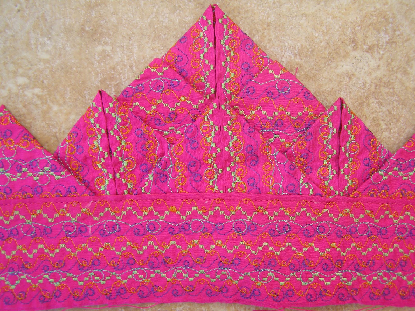
Shocking pink dupion silk
Stitch No. 146 in purple (1122)
Stitch No. 162 in lime green (1248)
Stitch No. 169 in mint green (1301)
Stitch No. 172 in orange (1278)
I decided to use a much more luxurious material for my second sample, with a much brighter colour, and chose a very bright pink dupion silk. This time I chose threads that were much richer colours than sample 1, with more contrast. I was very pleased with the final result this time, and it reminded me of brightly coloured saris. The deep purple that I used adds depth to the overall design and the light green provides the contrast to the background fabric that was missing in my first sample.

Total time spent = 3 1/2 hours

Sample 3 on paper


Finished sample (above)


Close up of front side of prairie point (above)


Close up of reverse side of prairie point (above)

Materials used
Yellow craft paper
Stitch No. 177 in variegated thread (Col. 2053)
Stitch No. 172  in light green (1301)
Stitch No. 177 in light blue (1075)

I decided to try sewing on paper as an experiment, with very interesting results... The more I stitched the paper, the more flexible it became and started to behave like a soft fabric. It eventually became quite floppy and unrecognisable from its original form. Paper was quite easy to sew on and the end result was very bright and jolly. It would have been difficult to sew any more stitching on this sample, as I think the paper would have started to disintegrate.

Sample 4 - Prairie points on plastic netting


Finished sample (above)


Front side of prairie point (above)


Reverse side of prairie point (above)

Materials used
white plastic netting, with sparkly flecks
Stitch No. 167 in red (1147)
Zig zag stitching (width 2.9, length 2) in orange (1278)
Stitch No. 166 in yellow (1024)
Stitch No. 167 in yellow (1024)

This was another experimental sample with a completely different type of background material. The plastic netting was flexible, but quite springy, so I needed to sew a row of stitching quite close to the fold in order to control it. I stuck to a range of bright, warm colours and didn't sew too heavily, as I wanted the neting background to show through. I liked the effect of sewing on a slightly more transparent material, especially as some of the stitching on the reverse side could be seen from the front of the sample.