Pages

Sunday, 15 May 2011

Module 1 Chapter 4 - Zigzag samples (page 8)

Module 1 Chapter 4 - Zigzag sample 1

For this sample I used purple and orange transfer painted satin, backed with white felt. I used a stitch length of 2.4 and different widths, ranging from 0.5 to 5.5 in purple thread (Madeira 1122). I let some stitches overlap, but not too many, as I wanted the orange fabric to show through. This took 1 and 1/2 hours to complete and the overall effect is quite pleasing, although I think that using one or two more thread colours would be even more attractive.


Zigzag sample No. 2  on black felt - changing stitch length

For this sample I used black felt as the main fabric and also for the backing. The colours that I used were as follows:
candy pink (Madeira 1117) in stitch lengths 0.5 and 4.5
orange (Madeira 1278) in stitch lengths 1.5 and 3.0
lime green (Madeira 1248) in stitch lengths 2.0 and 5.0
and metallic turquoise (Madeira No. 65) in stitch length 1.0
The stitch length was set at 2.5
(1 3/4 hours)


I think that the final effect is quite striking and was pleased with the overall colour combination that I chose. Overlapping lines of stitching with a different colour thread produces interesting effects and lighter colour threads in a narrow satin stitch can be used to 'lift' the piece.

Experimental zigzag sample No. 3

(1 1/2 hours)

The background for this sample was red, blue and green transfer painted satin, which was backed with felt. This time I changed both the width and length of the stitches.

The colours I used were as follows:
orange (Madeira 1278) stitch length 0.5 and widths 2.7, 3.1 and 4.0
blue (Madeira 1134) stitch length 2.0 and width 1.8
green (Madeira 1051) stitch length 3.0 and width 3.3
yellow (Madeira 1024) length 0.9 and width 0.9
red - I changed the length of the stitches and also the  width from 0.5 to 5.5 while stitching, which produced interesting 'blobs' along the lines. Again, overlapping different coloured stitch colours produced attractive effects and textures. The colour scheme is quite vibrant, although it is not my favourite combination.

Chapter 4 Automatic Patterns - Sample 4
( 1 hour)

For this sample I used light green and yellow/orange transfer painted satin. I chose automatic pattern No. 74 on my machine (a Bernina QE 440), which had a stitch length of 1.4 and width of 5.5 and produced a pretty, scalloped effect, which let the colours in the background show through. The threads I used this time were:
orange (Madeira 1278), lime green (1248) and yellow (1223). I started with orange, then green and finally filled in the spaces between them with the yellow. I left different spaced widths between the rows and also let some stitches overlap.
I was pleased with the final effect, as the colours of the satin showed through the stitching and I like the colour combination of the threads, which are quite summery and remind me of lemon and lime sorbet!


Chapter 4 - Automatic Patterns - sample 5
(1 1/2 hours)

For sample 5, I chose red, green and blue transfer painted satin and backed it with white felt. I used automatic pattern No. 85 on my machine. I discovered that I couldn't change either the width or length of the stitches, as these were preset at 3.60 (length) and 5.5 (width). The colours that I used were: blue (Madeira 1134), green (1051), metallic red and Astro 5 (a variegated metallic thread).
I sewed quite heavily over the fabric this time and let more lines overlap. This was mainly effective, but I think that I 'over' sewed some areas of the sample, particularly the red lines near the middle. If I were to try this again, I would just overlap the edges of the pattern in this area, to let the background show through slightly more.
Automatic pattern - sample 6
(1 hour)


For sample 6, I used purple and orange transfer painted satin and this time decided to use a combination of different automatic patterns:
No. 33 in purple (Madeira 1122)
No. 53 in orange (1278)
No. 73 in red (1147)
I started with the purple thread (as I found that starting with a darker colour and adding lighter colours over the top was the most effective way to work for these samples), and then built up the orange and red layers afterwards. This is my favourite automatic pattern sample so far, as I found that using different stitch patterns provided more contrast and variety than only using one stitch pattern and that using the red thread' lifted' the other colours that I had chosen.




Monday, 2 May 2011

Module 1 Chapter 3 straight stitch samples

Sample 1a)


I used blue and purple transfer painted satin as the background for this sample, backed with white felt and set my stitch length to 2.4. I chose a light golden brown thread, a light lime green thread and a golden yellow, to complement the background. The stitching is quite neat and I like the spacing between the rows and columns, but the lime green and yellow look quite similar when viewed from a distance.
Close up of sample 1a)


Sample 1b)


I decided to try the exercise again, using the same background, but slightly different coloured threads. This time I used a darker purple, orange and the lime green from the previous sample. Although the overall effect is darker, I prefer this sample because the thread colours don't overpower the background and there is a little more contrast between them.

Close up of stitching sample 1b)


Diagonal grid on black felt - sample2

For this sample I used black felt as a stabiliser and set my stitch length to 2.4. I used red, lime green and orange threads to stitch the grid. I was able to keep the lines quite straight and was quite pleased with the overall effect. It looks a little bit like tartan! (1 hour to complete).


Sample on calico  (3a)


For this sample, I used calico, backed with white felt. I used a multitude of coloursand stitched 'wiggly' lines in a horizontal, vertical and diagonal direction. I also changed
 colours quite regularly (no more than 10 lines in one colour). It did look quite messy once complete and some of the lighter stitching doesn't really show up in the photos. I then used a darker pink to stitch three thicker wiggly lines from top to bottom, but still thought it looked disorganised! (see photo below).

Experimental sample on calico with darker stitching


I thought that I would try again, using coloured fabric as a background. This time I used white satin which had been coloured with green and yellow transfer paints. Again, I sewed lots of 'wiggly' lines in lots of different directions and changed colours regularly. Once this was completed, I sewed three thicker diagonal wavy lines across the fabric in a mid-blue tone (Madeira 1134). I found this sample much more pleasing to look at due to the coloured background, and much prefer the effect of the diagonal lines (they look like blue seaweed!)

Green and yellow transfer painted satin as background- sample 3b)
1 hour


Sunday, 17 April 2011

Module 1 Chapter 1 Transfer Paint Experiments Post 3

Feeling encouraged by my last couple of attempts, I thought that I would try out the 'vivid' blue paint that was left in my sample kit. I applied this with broad brush strokes to the photocopier paper in thick blobs, along with some violet paint.


Vivid blue and purple transfer paint on white paper,
applied with a broad brush


I used quite heavy pressure to apply this to white satin on the 'wool' setting, and this took around 6 minutes altogether. I was careful to check that the fabric didn't singe. The colours came out beatifully this time and I was really pleased with this sample.

Bright, beautiful colours on fabric!

I wondered what this would look like if I transferred it again to stitched fabric, so I used a zig-zag stitch to sew lines onto some white satin in white 100% rayon thread. I transferred the paint in the same way as before and was surprised that it only transferred onto the satin, not the thread. I double checked that I had used synthetic thread (not cotton), but I had. Why had this happened? Surely it should transfer on to both?


I tried again, but with the same result. The effect was interesting though, and the colours still transferred really well, even though this was the second time I had used the paper.

Module 1 Chapter 1 Transfer Paint Experiments Post 2

 For the next experiment, I sponged violet and red transfer paint on to the photocopier paper quite thickly, leaving lighter patches in between. I used an iron on the 'wool' setting to transfer this on to the white satin. This time the colour transfer was slightly more effective, but still not as bright as I would have like. The red came out as orange, which was surprising.
Purple and red paint sponged onto paper

Transferred on to white satin


I wanted to achieve a much stronger, brighter effect with my next example, so this time I applied violet and red paints again with a medium sized paintbrush in big 'splodges' on to paper. I let quite heavy pools of paint collect and left this to dry. When I transferred this over to the white satin, I tried using heavier pressure with the iron and left it for longer, taking care not to singe the fabric. I was much more pleased with the result this time, as the colours came out much brighter (although the red still looked orange!)


A much brighter effect was achieved this time on the satin!

Feeling that I had finally 'got the hang' of this technique, I tried a few more experiments...
I used a large brush and a sponge to colour the next piece of paper with violet and golden yellow transfer paint, again quite heavily.
Purple and yellow paint applied to paper


I used the same technique as in the previous sample to transfer the colours over to white satin. These transferred quite well, but the yellow looks green and I realised that in my quest to achive deep colours, I had applied too much violet, so the final effect doesn't really have enough constrast.


I wondered what would happen if I applied green and purple paints together (if yellow looked green, what would green look like?!). I used a large brush again to apply the paint quite heavily to paper, and this time used slightly less purple than before. I also allowed the green time to dry slightly before adding the purple.


The paints transferred very successfully and there is a pleasing balance between the darker and lighter colour this time. Also, the green came out green, although lightly darker than the yellow transfer paint!

Module 1 Chapter 1 Transfer Paint Experiments Post 1


Violet and scarlet transfer paints on white photocopier paper (above). These were applied with a foam brush and I allowed the colours to seep into each other.


I used a hot iron to transfer the paints and achieve quite a vibrant effect on the fabric(above). The parts where the ink wasn't quite so concentrated have turned out to be a really attractive shade of pale lilac.


Vivid blue, red and leaf green transfer paints sponged onto paper with different amounts of pressure. This created lighter patches of colour and pools of deeper colours (below left).


When ironed onto the white satin, this produced an attractive, bright pattern, which remined me of a meadow full of flowers (below left).


I also tried transferring this onto white felt, which was an interesting experiment! This only took about 30 seconds to transfer before the felt strated to singe, so only a very light layer was possible to iron on, resulting in very light, pastel shades of the original colours (below left).


The next experiment that I tried was to paint stripes of green and golden yellow transfer paints on to paper with a broad brush for the background and then paint thinner, dark stripes of green over the top, which I let run up and down the paper. When I transferred this to the white satin, the colours didn't transfer so well, maybe because I needed to apply a thicker coat of paint to the paper, or mix a more concentrated mixture of paint. This was one of my earlier experiments and was not so effective as my later attempts.


I used green and yellow on the next examples too, but this time applied slightly more paint and let it dribble in different directions over the paper. I also dotted a few spots around with a medium sized paintbrush. This time, I transferred the colours onto a polyester 'chiffon' fabric, using the iron on the 'silk' setting for around a minute. This was very effective, although this can't be seen very well from the photograph, and the fabric looks particularly attractive held up against the light.


Module 1 Chapter 1 Collecting Colour

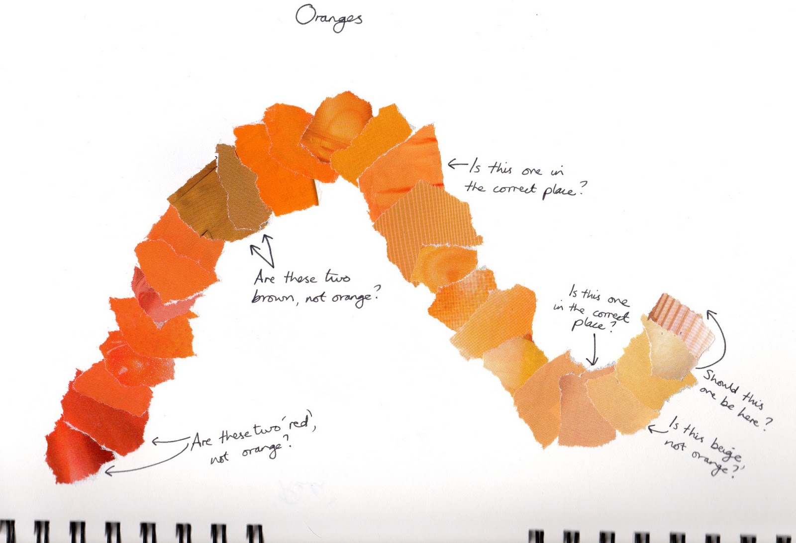
I found lots of different examples of colours that I liked in magazines. I have tried to organise these together in groups that were similar. For example: dark blues, 'ethnic' mixes of bright pinks, oranges and purples , warm oranges and golden yellows and lighter pastel colours. 


It was interesting to look at the colours I had chosen at the end of the exercise. Some of the colours, like the darker blues attracted me more than I thought they would. Perhaps a combination of these would look good together in a piece of embroidery? I hadn't really chosen many primary colours other than the blues - maybe I prefer more 'muted' colours?

Module 1 Chapter 1 Looking at Colour