Pages

Sunday, 20 May 2012

Module 2 Chapter 4 (page 19)

Cable Stitch

Cable stitch with the presser foot on

Sample 1 (below)

I used a variety of different threads for this sample:
a light blue Anchor hand embroidery thread
a thin, variegated purple wool
a thicker, textured purple wool
a mid-blue blue hand-dyed linen thread
a bright green Wonderfil thread (Razzle No.250, wt 8)


I sewed the lines of stitches very close together and enjoyed creating different textures this way - some threads were much more raised from the surface than others, and the textured threads created little 'nobbles' which I thought looked interesting.
I used a purple thread in the top needle throughout, and it was pulled through to the surface of the stitching. The wool was more difficult to sew with than the embroidery threads and there were places where the thread in the top needle got caught up and created loops on the surface.

Zigzag stitch

Sample 2 (below)

I tried sewing in cable stitch using different widths and lengths of stitch, with different types of thread. The following picures show:
metallic thread ( Wonderfil Dazzle No. 941, wt 8)
Madeira Glamour thread Col. 2070
Madeira variegated Decor thread (Col. 1591, wt 6)
thin purple silk ribbon (interesting knobbly effect, but the thread from the top needle kept becoming knotted).


and in the picture below...
light blue hand embroidery thread
purple wool (I liked the softer 'wiggly' effect of the wool, but it was too stretchy and kept skipping stitches or breaking).


Cable stitch and automatic patterns

Sample 3 (below)


I tried out a few different stitches and threads, with varying degrees of success! I found that the more 'open' kinds of pattern worked better on my machine, with threads that were not too bulky. Perle and hand embroidery thread were ok to use, as long as the machine didn't have to go back on itself because the thread then knotted and got caught on the bobbin.
Stitch Numbers used (top to bottom)
119
146
155
153
126
117
119
120
126
156
160
169

I liked the effect created by No. 119 and 117, which covered the background fabric well, but also liked No. 120 (with the open circles) for a more delicate effect.

Cable stitch and free embroidery

Sample 4 (below)


I used a metallic green thread here (wt 8) on black felt. The thread became a little knotted and caught up, but was easier to handle once I tightened the top tension a little.

Sample 5 (below)


For this sample, I used a viscose wt 6 thread (Madeira). I liked the effect created by using a variegated thread, but found this quite difficult to handle (lots of time spent untangling thread in the bobbin!)

Sample 6 (below)


I used a bright green wt 8 thread here, and still found this a little tricky to handle, as can be seen from the small knots and tangles on the surface.

Sample 7 (below)
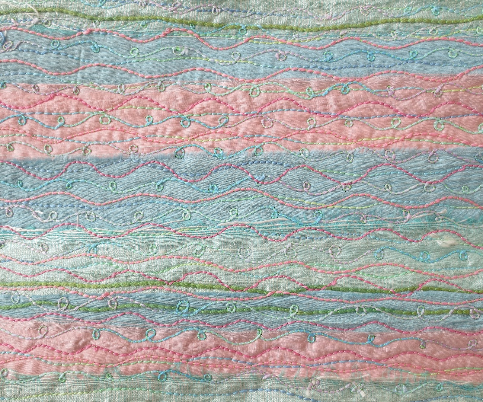

For this sample, I tore strips of pink, blue and green silk and layed them on a backgound of white felt. I backed this with medium weight Vilene before sewing. This time I tried lots of different threads over the background in lines. This was much easier to sew than the previous three samples (perhaps because the layers were thicker?), and I was pleased with the final results. Threads that I used were cotton perle wt 8, a thick cotton knitting yarn and hand embroidery threads.
Comparing different types of threads

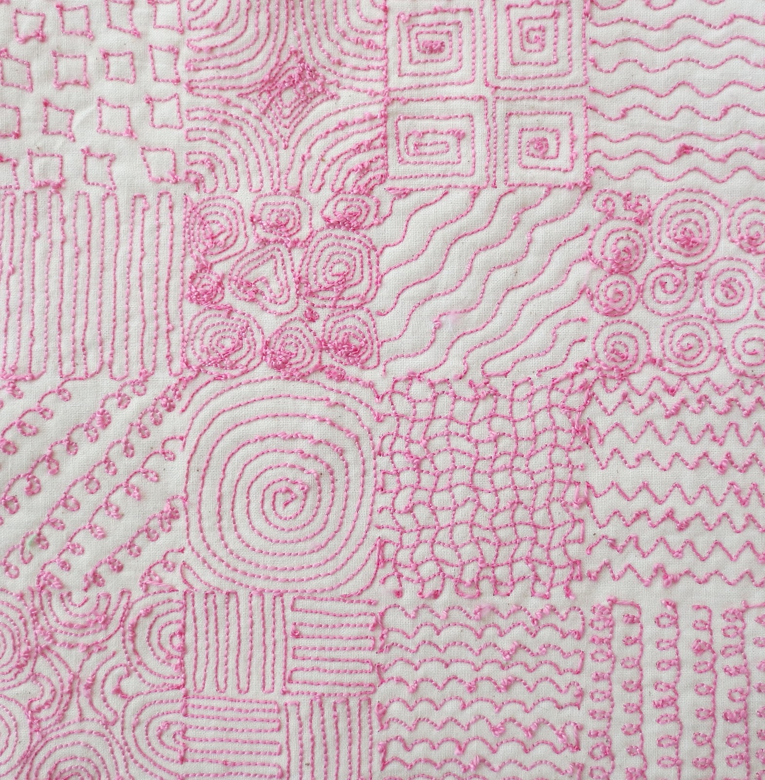
I drew a 4 x 4 grid, which I then divided into 16 squares and drew a different pattern in each one. Using a pink thread in the top needle, I then stitched the design in cable stitch from the back of the material.
For this first attempt (sample 8), I used a bright green Wonderfil thread in the bobbin (Razzle No. 250, wt 8). I loosened the bottom tension as much as possible and kept the top tension at around 3. When I turned the fabric over, the designs had come out quite clearly, but there were little knots and jumps in stitching. I tried tightening the top tension a little more (to 4 or 5), and this seemed to help reduce the problem. I also found that I had to keep moving, as knots would easily form if stitching too long in the same position.

Sample 8


For the next sample (No. 9), I decided to use a metallic thread in the bobbin (Madeira Glamour No. 2070). The thread seems to create a more dense effect here, and I think that the stitching is a little neater than my first attempt. I liked the metallic thread here and it was also easier to sew with than I thought it would be.
Sample 9

For my third attempt (sample 10) at sewing the grid, I used a pink perle Anchor hand embroidery thread in the bobbin (wt 8). I kept the top tension to around 4, and the stitching seems reasonably neat - there are only little knots and loops where the patterns are more complicated, such as the spirals.

Sample 10


Cable stitching a design

I found an image of waterlily seed pods that I thought would make a good design for this sample.


I chose some felt that had a mixture of colours as a background material (pink, green, purple) and used a stabiliser behind it. The outline of the design was marked out on 'stitch and tear' and stitched the outline of the seedpods from the back, using cable stitch in the bright green thread in the picture below (sample 11).
I also stitched around the openings for the seeds inside the outline in the same bright green, to link the colours together. The inside of the openings was sewn using cable stitch again in a dark maroon hand embroidery thread, in spirals, which raised the surface of the dseign a little. I kept a bright green thread in the top needle, and this has been pulled through to the surface, creating little speckles of green.
I stitched the inside of the pods in a variegated viscose Madeira thread (Decor Col 1591, wt 6), in lines and circles, which I like the effect of, but my machine found quite difficult to sew. Again, I kept the bright green in the top needle, as I liked the contrast between this and the pink of the main thread used.
Overall, I really liked the final design, and learnt alot about how to stitch with thicker threads, especially how to change the settings on my machine.
(Time spent = 7 hours 40 minutes)

Sample 11


Cable stitching the background of a design

I used the same waterlily design as for the previous sample, but this time changed the colour scheme and also took away one of the seed pods, in order to expose more background area (sample 12).
This time, I used a wider variety of threads, with varying degrees of success!

I stitched the outline of the pods using a light green hand embroidery thread, and a dark purple in the top needle. I had some problems with the thicker thread knotting and breaking, and couldn't seem to get the tensions quite right. I sewed the inside of the seedpod 'holes' in a dark purple hand embroidery thread, using spirals again, which my machine seemed to enjoy a little more, and this provided some tonal contrast to the other colours I used. I then stitched the background of the design in lines, using a metallic teal, purple wool, a light blue embroidery thread and a thinner, purple Wonderfil thread. The machine hated the wool, which kept stretching and breaking, but seemed to cope with the other threads reasonably well. I kept the dark purple thread in the top needle throughout.

I liked the colour comination of this design, and found it interesting to only stitch the background, but think for this to be more effective, I needed a design with more background showing. I was also itching to stitch inside  the seedpod on the left, as this seemed to be quite a large space to leave alone, but wasn't sure if this would be 'overstitching'.
(Total time = 4 1/2 hours)

Sample 12


Using the stitches from Chapter Three and Chapter Four

For the next two designs,  I went back to my source material for chapter one, and chose the flower image I had already used for some of the printing designs in chapter two.


I thought that using the same image, but in different sizes would create some depth to the design, and I also slightly overlapped two of the flowers to link the images together. I chose a blue and purple hand dyed piece of felt as my background and used a stabiliser behind this. For a colour scheme, I decided to pick up some of the purples from the felt, as well as adding touches of brighter colours.


Sample 13


The stiches and threads I used were as follows:
Granite stitch inside the flower petals in a variegated purple thread (Wonderfil Accent No. 10, wt 12)
Granite stitch inside the middle of the flowers in a variegated light green, blue and turquoise perle Anchor hand embroidery thread
Whip stitch for the outline of the flowers
Cable stitch to create lines around the shapes of the flowers (Wonderfil Dazzle No. 941 wt 8)
and the Madeira Glamour thread, used in earlier samples.
Vermicelli stitch to fill in background space in a variegated blue, green & yellow thread (Wonderfil Fruitti No. 02, wt 50)
Moss stitch in a variegated pink, purple, lemon and brown thread to fill in background space (Wonderfil Mirage No. 12, wt 30)
Whip stitch in the variegated light green, blue and turquoise hand embroidery thread used earlier, to outline the flowers. A dark blue was used in the bobbin, and can be seen if looking closely.


Close up of the stitching


(Total time spent = 9 hours)

Using stitches, a second piece

For the second piece (sample 14), I used the same flower outline as the previous sample, but this time on a background of transfer painted satin. I sponged the transfer paint onto paper before ironing onto the satin, to create a mottled effect, leaving the flower shapes blocked out by cutting out their shapes in paper and  fixing these to the surface. As I thought this looked quite harsh, I lightly ironed over the white patches to transfer a lighter coating of colour onto the satin.


Sample 14


I used a variety of threads and stitching to complete the design:
Cable stitch in a bright green thread to create lines around the flower shapes (Wonderfil Razzle No 250, wt 8).
Cable stitch in  light purple hand embroidery thread around the adge of some of the flower shapes
Moss stitch in  a variegated lilac, pink and light green thread inside the petals of the flowers (Wonderfil Accent No. 20, wt 12)
Granite stitch to fill in the centre of the flowers in a metallic purple thread (Madeira Col 213)
Granite stitch to fill in areas of the background in a lilac thread. I didn't cover the whole of these areas, I tried to echo the background colours by stitching over any lilac parts.
Vermicelli stitch in  an Anchor variegated blue, green and turquoise perle thread (wt 8) to fill in background areas. 
Feather stitch in the metallic purple that I used for the granite stitch, with a bright green in the bobbin


Close up of the stitching


This sample has a much lighter and feminine feel to it, compared with the sample I completed on felt. I felt that I had made progress with some of the stitching techniques, e.g. the moss stitch and feather stitch, but still have quite alot to learn about cable stitch! I think that I need to perfect exactly which tension to tighten to for the top thread for this to start looking neater. I did make the decision to stitch around the outside of the flower shapes, but do wonder what the design would have looked like had I left this, like the sample in the course materials. I like the way the lighter areas of fabric show through the stitching inside the petals though, and also liked the effect of picking up some of the colours in the background fabric, but leaving other areas showing though where I used granite stitch.

(Total time spent = 8 hours)

Sunday, 11 March 2012

Module 2 Chapter 3 Threads and Stitches (page18)

Vermicelli Stitch

Experiments on different fabrics...

Sample 1


This was my first sample, backed with green felt. I sewed quite large curves and used a variegated thread in different shades of green (Wonderfil 'Fruitti' 02 wt 12).

Sample 2


This was backed with calico that I had dyed with dilute red and yellow procian dyes (crumpled up in a plastic beer glass!). This times I used a variegated pink top thread (Wonderfil ACM 35 wt 12) and a cerise thread in the bobbin, and sewed in tighter curves. I felt a little more confident this time and enjoyed sewing in a continuous 'wiggle'!

Sample 3


This sample is sewn on blue silk, and I used the same variegated green thread that I used for sample 1. I kept the cerise thread in the bobbin, and this can be seen from the front, creating a stippled effect. I used quite small curves this time and felt much more confident that I wouldn't cross over the line or run out of room.

 
Vermicelli using Zig-zag stitch
 
 
Sample 4


This sample is sewn on silk velvet that has been dyed with blue and red procian dyes that have mixed in places to create a rich purple. This time, I altered the width of the stitch to 2.4, and was surprised that this didn't make the stitching much more difficult to complete. I liked the way that the stitches 'sunk' into the pile of the velvet & it would be interesting to try this using smaller curves for the vermicelli stitch.

Sample 5


This sample has been sewn on a maroon-red felt, using a variegated pink thread (Wonderfil ACM 35 wt 12). I altered the stitch width from 2.4 to 5.0, starting at the thinner stitch width. I like the effect that using a variegated thread creates in the curves of the vermicelli, when using the wider stitching.

Sample 6


This sample is sewn onto blue silk, using the same stitch widths as those used for sample 5, but with the light green thread on top and a dark pink in the bobbin. This needs a stiffer backing, as the denser stitching has pulled the fabric in in places.

Sample 7


This sample is sewn on a loosely woven fabric (it was an offcut, so I'm not quite sure exactly what it is), using a stitch width of 2.4. The fabric was easy enough to sew on, but would need a darker thread combination to show up more, as there is not enough contrast between the colour of the stitching and the background.


Granite Stitch

Sample 8


I used green felt for the background, the light green thread on top and a dark pink thread in the bobbin. I managed to sew in quite small circles and liked the stippled effect created by the pink thread being pulled up the the surface of the fabric.

Sample 9


I used the same thread combination as sample 8 on the woven fabric, to compare the effect. I think that granite stitch looks better on this fabric than the vermicelli, as more coverage is obtained.


Sample 10


This sample was sewn on the same silk velvet that I used for vermicelli stitch. I really like the effect achieved by the stitches sinking into the velvet, leaving little tufts of fabric to stick out. The final effect is quite 'dreamy' and reminded me of a cloud in a summer sky.

Sample 11


This time I used a metallic thread in a dark turquoise onto a tweed fabric. I don't really like the colour combination, but it was interesting to see how the granite stitch seemed to change the darker pattern in the tweed.

Whip Stitch

Sample 12


I used a Wonderfil 'Tutti' thread for the top thread and a dark pink thread in the bobbin. I changed the tension from 3 to 10 (from left to right), which pulled more and more of the bobbin thread through. I also found that I had to move the fabric more slowly as I increased the tension, to stop the thread from breaking.


Feather Stitch

Sample 13


When I started to sew feather stitch, I found it a little bit difficult to make it look any different to the whip stich in the previous sample. It wasn't until I got to the last two tries on this calico that I began to get the hang of it, and moved the fabric more extremely, with a wider stitch, to achieve the feathered effect. I think that I need to try again and also run the machine more quickly...


Sample 14


I went back to feather stitch again at the end of the chapter and had another try. I ran the machine much more quickly and experimented with moving the fabric more 'violently'. I did achieve a more feathered effect this time, and the tension was right for the fabric (felt). It still doesn't look like the sample in the course materials though...

Moss Stitch

Sample 15


This was my first experiment, and I used a metallic variegated thread on calico. I tried out different stitch widths, which created bigger loops as the width was wider and also tried moving the fabric slowly and quickly. This was completed out of a frame, and the fabric ruckled quite alot, even with a stiff backing. I liked the effect of the larger loops though. I used a monofil thread and removed this once an iron on stiffener had beed placed on the back.


Sample 16


As I wasn't pleased with the calico sample, I tried moss stitch again at the end of the chapter, this time on felt and in a frame. I used a variegated thread (Wonderfil wt. 30) in lilac, blue, pink and brown for the loops in the bobbin and a monofil thread on top. I was much more pleased with this version and could see the progression in my technique from the earlier samples. Using a frame was much better for the fabric (even though I find them annoying!).

Using the Stitches

Sample 17


I chose one of my images of leaves from Chapter 1 and used cotton velvet that had been dyed with dilute green and blue procian dyes. I sewed around the outilne of the leaves using moss stitch and a variegated metallic thread (Madeira Supertwist No. 290). I then sewed around this using a mixture of whip stitch in dark pink and straight stitch in dark green thread, with a dark pink in the bobbin. I wasn't quite happy with the open space of the leaves and also felt that the straight stitching was a little too regular and 'neat'.

Adding some extra stitching...


I decided to fill in the empty spaces of the leaves, using a variegated yellow, orange and cream thread. I felt that this improved the design, but still didn't like the straight stitching around this.

Aquilegia - Sample 18


I managed to buy some space dyed felt for this sample (from 21st Century Yarns), which I loved, and decided to try another sample. This time I chose some images of aquilegia, which I dotted around the felt in different positions. I did find it quite difficult to draw on the felt though! I sewed around the outline of the flower with a variegated thread (Wonderfil SD 12, wt 30 in lilac, dark pink and brown) & then just inside this outline with a lilac thread, using whip stitch (top tension set at 6). Then I sewed in the stamens in a variegated yellow & orange thread, which I felt 'lifted' the design. For the straight stitching around the outlines, I used a red and pink thread on top and a yellow thread in the bobbin. I tried really hard not to be too 'neat', and was much happier with the final result. I like the subtle effect of the outines not being too obvious, which draws you to look more closely at the design, and I feel that the straight stitching is more 'artistic' in this version.

Wednesday, 15 February 2012

Module 2 Chapter 2 - Making Patterns (page 17)

Collecting Patterns

I collected patterns from craft papers that I already had tucked away in boxes. I particularly like the patterns on these Japanese papers.


These papers are textured and some of the patterns show symmetry (reflective & rotational).


Patterns collected from browsing through various magazines...
I love the pattern & colours that decorate the ceramic owl and like the random pattern of butterflies combined with the unusual colour combination.


I like the way that the vertical pattern of stripes contrasts with the horizontal set below.


A postcard from Morocco, showing striped fabric


More clippings from magazines, showing patterns that appealed to me...


Patterns in Nature


Soap bubbles


A beautifully striped shell


The patterned wing of an insect


Cracked mud!


A close up of quartz crystal - I really like the striped pattern and gradual change in colour.


I like the spiral pattern on the cut end of the leeks (above).

A collection of patterns on tree bark (below). Some of these are very beautiful and I like the textures show in each picture too, particularly the curling acer bark.


Patterns on shells (below).


Finding images for printing

I looked back at the drawings I completed for Chapter 1 of Module 2 and thought that the flower below would be a good basis as the design for a printing block. There are some interesting shapes in the design, and the petals are of varying shapes and sizes.


I cut the printing block out of thin foam and glued it onto stiff cardboard. I also made a small handle for the back. I was pleased with the result, especially as noone else could possibly have the same block, as it had originated from my own drawing (I'm starting to see why the drawing is so important!).


Straight Repeats (sliding/translational symmetry)


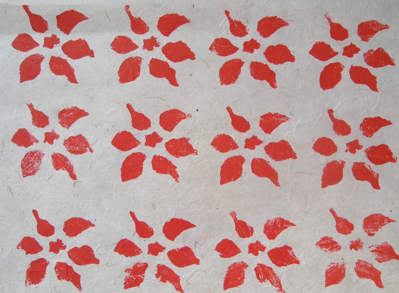
The print is quite clear and I achieved quite a good coverage over the surface of the paper. I printed onto a rough textured craft paper.

Spot Repeats


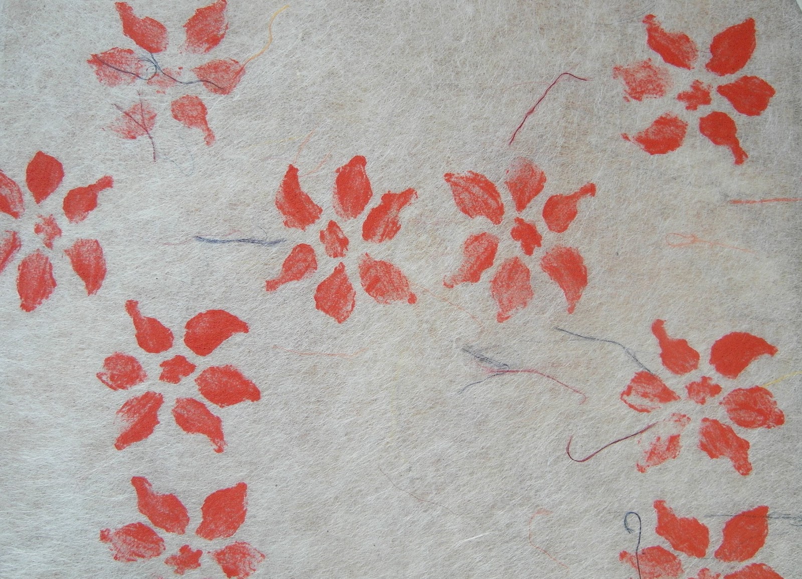
For the spot repeats, I changed to yellow acrylic paint and used a translucent craft paper (I think it was made with silk fibres, but have had it a long time, so wasn't quite sure). I had to be careful not to damage the paper, as it was very delicate, but was pleased with the final effect.


I experimented with the spot repeats on a darker, patterned paper. I first printed in red over the dark blue background, but the result was very dull, so I decided to make a second 'ghost' print in yellow, slightly to the right of the first print. This was much more dynamic and I liked the effect of having two prints together.

Half drop Repeats


I used yellow acrylic paint over a turquoise background that had been splashed with bleach. This created a 'greenish' pattern that had good coverage over the background. This would be a good print pattern to use on plain papers and fabrics, as not much of the background shows through.

Mirror Symmetry

I created my stencil using stiff card, as I couldn't find any plastic to use, and the foam that I had was a little too thick. I used a sponge to apply the paint to the stencil onto a plain background. Some of the prints came out very clearly, and others were a little more blurred, depending on how hard I pressed the sponge through the stencil and how much paint I applied.
I took the idea for my design from a picture of peonies.


Rotational Symmetry


I went back to using my print block for the rotational symmetry patterns - I first used A4 paper (above), but my block was slightly too large to create good coverage to see the effect of the pattern. I tried this again, but used a larger sheet of brown paper (below). I left a space in the middle of each set of rotations and was pleased with the overall effect.


I tried another sample on gold tissue paper, but without leaving a space between the top and bottom prints, to obtain greater coverage over the paper. The effect was very attractive, although this can't be seen clearly in the photo because the gold doesn't really show up.


Experiments

I used my printing block on textured paper that I had painted with watered down acrylic paints. I used a straight repeat pattern, first in yellow and then overprinted in red, slightly to the right of the first print. If this was repeated on fabric, with fabric dyes on the background, it would be a good starting point to stitch on.


I coloured the same textured paper with Aquarelle crayons and then blended the colours together with a wet brush. I then used my stencil and acrylic paint to create a pattern, using a more random placing of the flower. I liked the contrast of the darker coloured flower against the lighter background in this experiment.


Printing on transfer painted satin, using my own block. I used mirror reflective symmetry in red acrylic paint for this.


I liked the way that the flowers showed up clearly over the lighter sections of the fabric, and seemed to blend into the darker sections.

Stitching onto the fabric
I used yellow and orange machine embroidery thread for this. The orange defined the edges of the printed flower pattern and the yellow highlighted some of the petal shapes, as it was lighter than the other colours used.


Adding stitching to the design added definition to the prints. I liked the areas where I only stitched around part of the petals, as this gave the impression of light catching them.

Print and Stitch

I experimented with different print blocks that I already had on cartridge paper that had been painted with dyes.

Small flower wooden print block (above)


Rubber print blocks (above & below).


I liked the small flower print block that I used in the first photo and used this to transfer a pattern to some purple and orange transfer painted satin. I used purple transfer paint to do this, in order to blend into the background. I then stitched my favourite flower design in the style of Cefyn Burgess over the background. I repeated single flowers from the original design, rather than copy the picture, as I thought that this would produce a more pleasing result. I really like the way that different colours from the background show through the petals of the flowers, and overall, it reminded me of a field of flowers at sunset. I did have a little trouble with the needle 'catching' the satin though, and the 'pulls' in the fabric can be seen around some of the flowers.


Further thoughts on use of pattern...

Pattern in machine embroidery could also be used in the following ways:

borders and edging
as a background to be embroidered over
as a main design to be embellished
to decorate items such as cushions, bags and vessels
the negative space between patterns can be used as the basis for a new design

I'm sure there are lots of others uses that I haven't thought of yet!