Chapter 1 - Shape and Form
Thin and spiky shapes


This one has a rounded form, but is made up of spiky tufts.

Pencil sketches (4B pencil)

I love the spiky shapes in this photo as well as the dramatic colours.

Pencil sketch of holly (above)

Pencil sketches of thin and spiky plants in 4B pencil (above).


Rounded Forms and Shapes

A pen drawing of this photo of a plant with rounded leaves (above)

A small pen sketch of these rounded flower forms (above)


A pen drawing of the rounded forms of these flower heads (above)


Lots of roses have rounded forms...


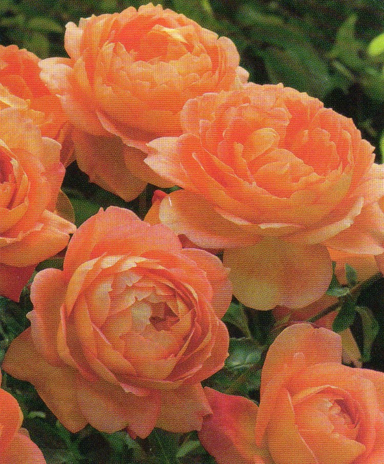

This rose head has a rounded form and also 'crinkly' edges (above)


Crinkly edges


Pen sketch of Bluebells (above)


'Teardrop' forms and shapes

A pen sketch (above)


Other shapes and forms that I liked...

I love the colours in this close up of a leak and the interesting lines created by the veins.

This would possible make an interesting form for the tassel making exercise further on in the module.
Drawing and Stitching flowers

The same flower head, drawn in different sizes (above)
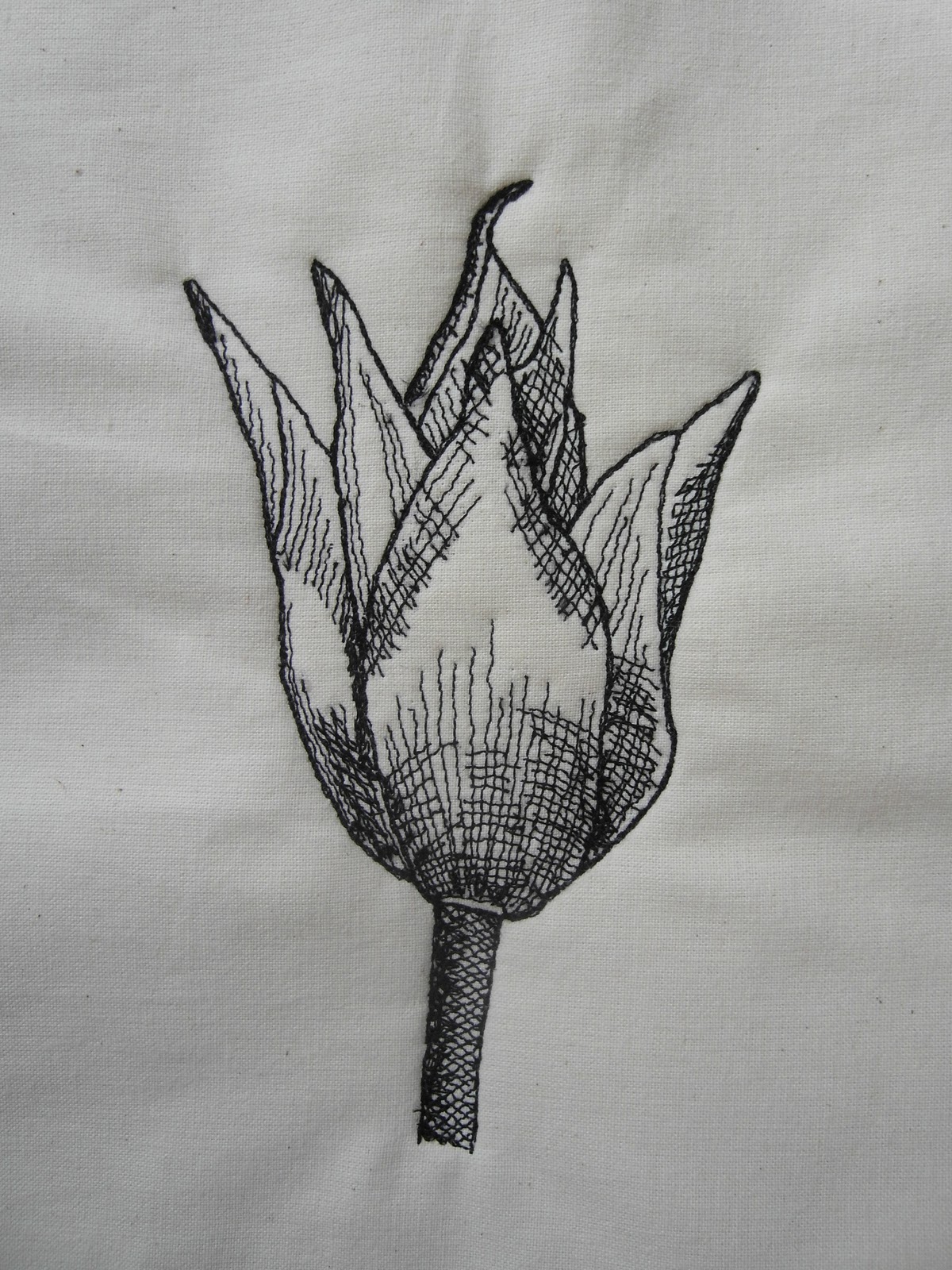
These tulips have a 'teardrop' form when closed, and each petal has a teardrop shape (below).


Chapter 1 Sample 1
My sketch - pen drawing of one of the tulips from the photo above. I have used cross hatching to show form.

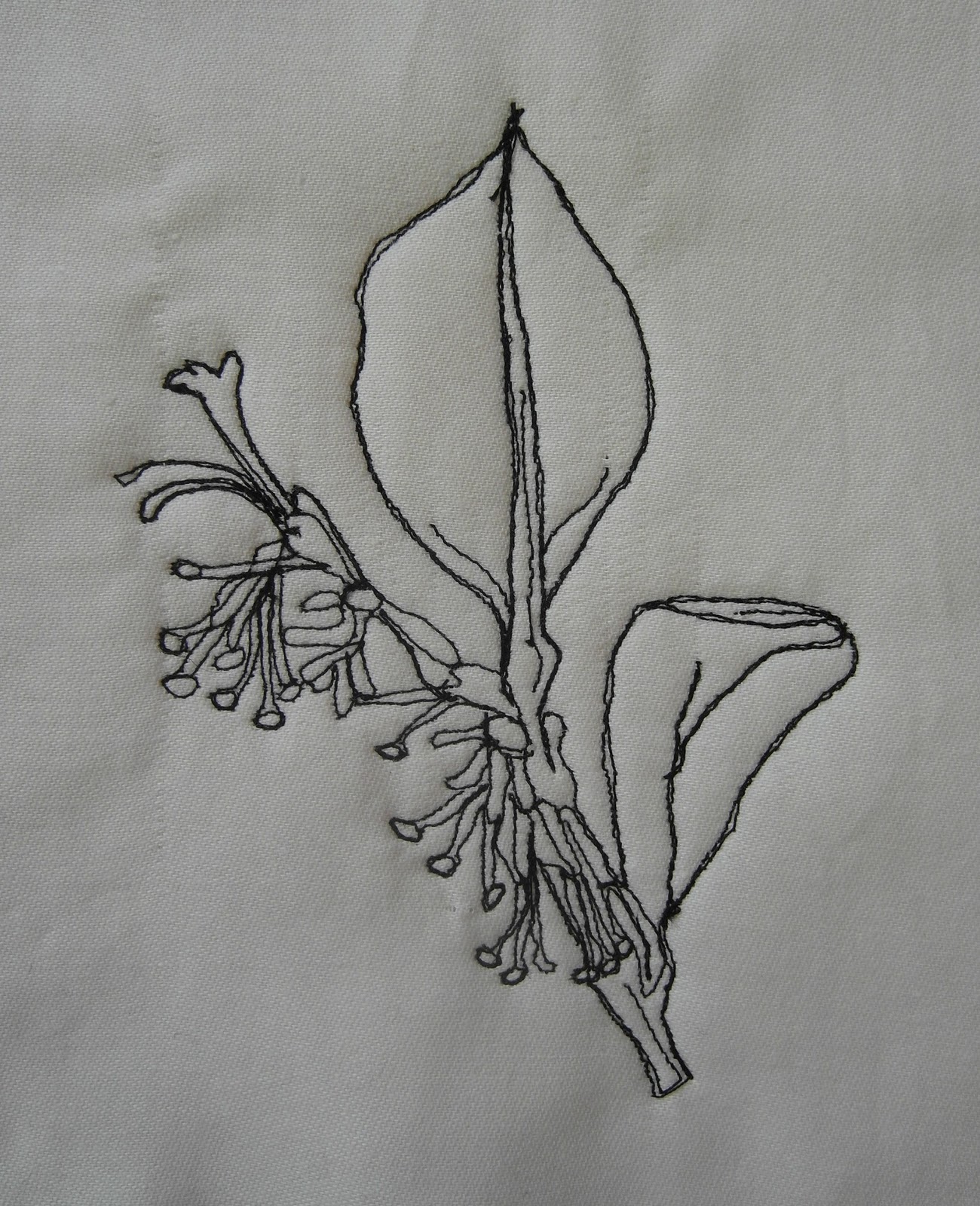
Stitched Flowers
Black thread on calico, back with white felt. Creating the form was not as difficult as I thought it would be, although I was quite nervous about trying to draw straight onto fabric with thread. Once the outline was created, it became easier to fill in other parts of the picture, as I had point of reference to refer to. Deciding which parts to stitch inside the flower to show form was more difficult, and I found that I couldn't use as much stitch as pen for this, as it began to look a little heavy. I was quite please with the final result, although I think that some of my lines are too 'neat' for the cross hatching and I should have made these look a little more natural & 'free' for a more realistic effect (below).
Cefyn Burgess
Pictures of Cefyn's work...


I really enjoyed looking at Cefyn's work - especially the way in which he uses black thread as if he was drawing in pen. His work has quite a 'free' and light feel to it, almost as if he is sketching with the needle. I particularly liked the cup and saucer embroidery, which is very detailed and uses a variety of textures in the stitching. It looks as though this has been completed with a dark blue thread instead of black. This work is also quite 'quirky', which made me smile.
My own stitching in the style of Cefyn Burgess
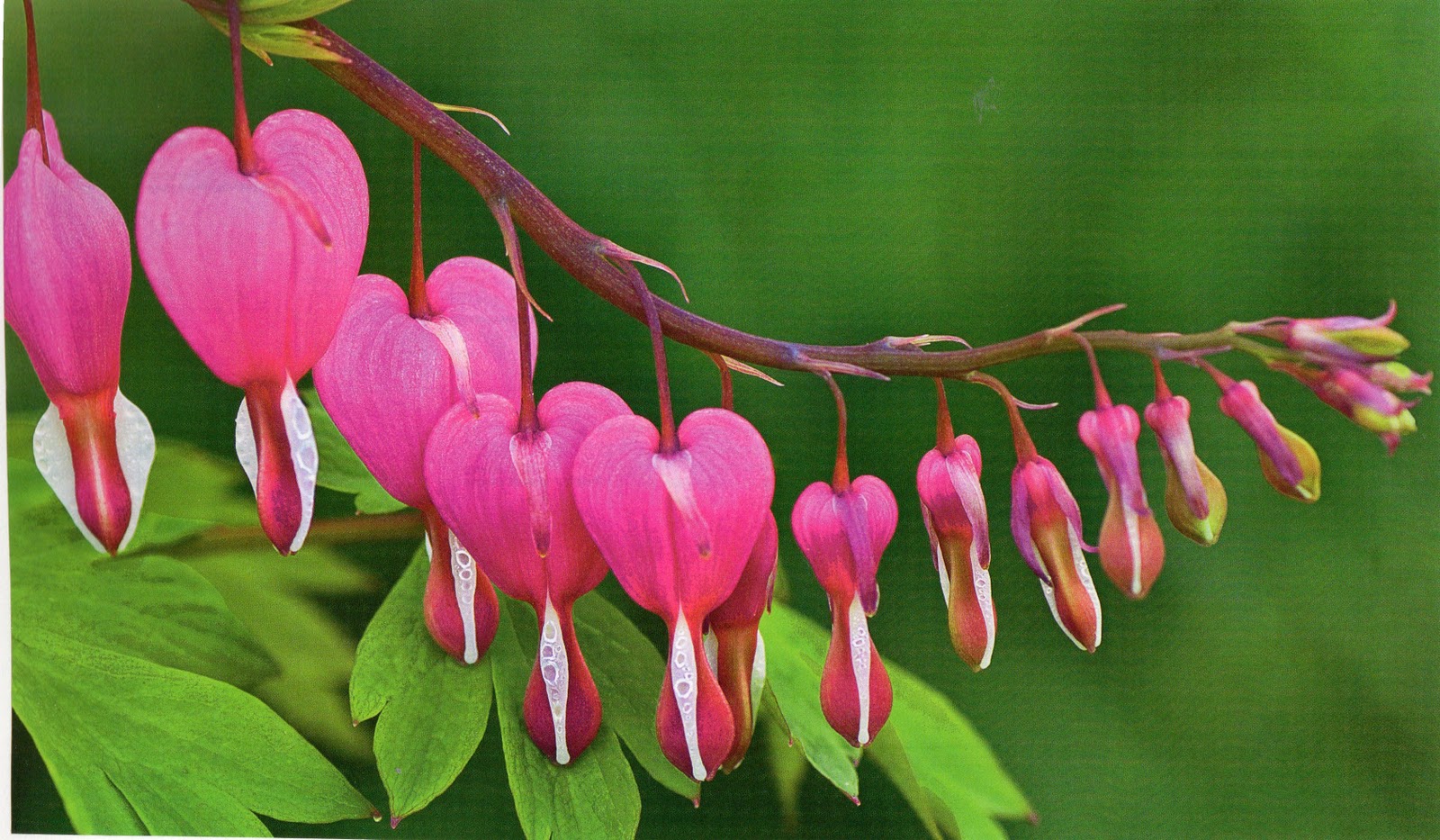
Chapter 1 Sample 2 - Bluebells
My Sketch (black pen)
My Sketch (black pen)

The stitched version...

I stitched the outline of the flowers first, going over each line twice with the black thread. Then I stitched some of the line details inside the flowers, as suggested by the original picture. I think that going over the lines twice made the lines look a little 'dead' and not drawn, as I had been intending, maybe because I tried to stick too closely to the first line of stiching, but I was please with the lighter stitching inside the flowers.
Chapter 1 Sample 3
Chapter 1 Sample 3

The stitched version...

I think that I followed the correct proportions for the flowers in this version, but decided that this type of stitching lends itself to smaller, or more detailed flowers, with more lines.
Chapter 1 Sample 4

The stitched version...
With this sample, I tried to achieve a more 'drawn' effect by going over each line twice, and trying not to follow the same line exactly. I think that this design is more effective than the bluebells, but don't really like the big spaces inside each leaf.
Chapter 1 Sample 5
My sketch

The stitched version...


The stitched version...

I was much more pleased with this sample as it has a 'drawn' feel about it. I felt that I moved my technique on with this piece, as I realised that I had to move the needle in the same direction as I would a pen or a pencil, when sketching. This did mean lifting the needle at the end of a line and moving the fabric to the start of the next line, but was much more effective, as was not worrying so much about being exact. I also like the combination of both straight and circular line making in this sample.
Grinling Gibbons
Examples of Grinling Gibbons' work


There are lots of rounded forms in this carving (the vase, faces & fruit) and these are contrasted against other shapes with feathered and crinkly edges (corn, leaves & wings). The focal point is the vase in the centre, and the rest of the carving cascades out and down at each side.

This close up shows the detail of this carving. Rounded forms are used again, e.g. the apple and the plums, and these are contrasted against the curled leaves and delicate flower shapes. The detail and realistic nature in the folded 'cloth' drape on the left hand side is quite amazing.

This carving again shows contrast between rounded forms, longer shapes and more textured details. I particularly like the spiral effect created by the flowers at the bottom.

This picture shows a close up of one of Grinling Gibbons' carvings. The focal point is the rounded, closed flower in the centre, and the other forms and shapes seem to 'spring' from this. There are lots of curved forms and shapes in this carving that gently cascade downwards. In the background, the seedheads and smaller flowers create a contrast with the larger forms in the foreground.
My sketch of a carving

This would be interesting to stitch because there are a variety of forms and shapes. Denser stitching could be used for shading inside the flowers/petals, to show form.
My Own Flower Arrangement

These were quite tricky to arrange and then photograph in a 'Gibbons' style, as it was difficult to recreate the flowing shapes that he used in the carvings. A few paperclips and pieces of string were involved! Also, I had to used glittery seedheads, as it was Christmas, and I couldn't find any natural ones anywhere. My husband had the idea to take the photo at an angle above the arrangement, and this really helped, as the petals of the roses could be seen more clearly.
The same arrangement in greyscale...

A Pen Sketch of my Flower Arrangement

As my sketch is quite detailed, I decided not to include any cross-hatching to show form, as I thought this might make it look too 'busy'.
My Stitched Sample, taken from my sketch

Evaluation
This sample turned out better than I thought it would because I thought the amount of detail might make the stitched version look a little messy. I think that the overall shape is quite accurate when compared to the sketch, although I could have made the seedheads slightly larger. I enjoyed stitching the roses, and once I had completed the overall outline, sewed from the inside flower petals to the outside, as this created a more 'natural' effect. The chrysanthemums were the most difficult to sew, as they involved sewing lots of lines, but I used the technique that I developed of sewing the line as if I were drawing; taking the needle off the fabric at the end of each line and starting at the beginning of the next one. As the design was already quite detailed, I decided not to include any cross-hatching (as I had with my sketch), as this would look too busy/messy. If I were to do this again, I would probably swap the chrysanthemums for a more solid shape!
(time taken = 4 1/2 hours)
Creating a Void
My Arrangment of Vases and Jugs

My tracings of the outlines of the shapes
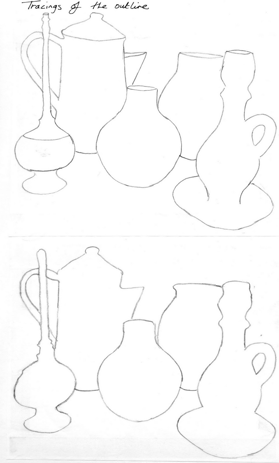

I decided to use the third tracing as the basis for my sewn sample and to only stitch in the background.

I used small circles of white thread to cover the background behind the vases and jugs. I decided not to stitch inside the shapes, as I wanted to see how much they would 'jump' off the page when finished. I didn't overlap many of the circles, as I thought there was probably enough coverage to show the void space and the form of the vases and jugs. The contrast between the background and the shapes is quite stark, and gives a 3 dimensional effect to the final picture. I didn't really enjoy working in black and white, but found the effect interesting to look at, and could see how this technique could be used in future projects.